For this project, I worked with a team of designers to redesign Amazon's Subscribe & Save feature to make it more convenient and accessible for users. Subscribe & Save allows Amazon users to subscribe to select products on Amazon and receive regular deliveries of those items. In order to complete this goal, we conducted user research, competitive and comparative analysis, developed personas for our users, and created a fully functioning prototype of our design in Figma.
My Role: UX Designer
Duration: 2 weeks, July 2020
Tools: Figma, Whimsical
Key Skills: User Research, Competitive Research, Wireframing, Prototyping, Usability Testing
Research
User Interviews
In order to find out how we could improve Amazon's Subscribe & Save feature, we interviewed users about their experiences with using both Subscribe & Save as well as other subscription-based services. We then compiled this data into an affinity map to sort out the responses.
We found a few key observations through this process:
1. Many Amazon users didn't know what Subscribe & Save was.
2. The users who did use Subscribe & Save weren't exactly sure how much they were saving every month.
3. All users like subscription-based services because it allows them to save money.
1. Many Amazon users didn't know what Subscribe & Save was.
2. The users who did use Subscribe & Save weren't exactly sure how much they were saving every month.
3. All users like subscription-based services because it allows them to save money.
We made sure to keep these observations in mind throughout the entire design process in order to make sure that we were designing a feature for our users.
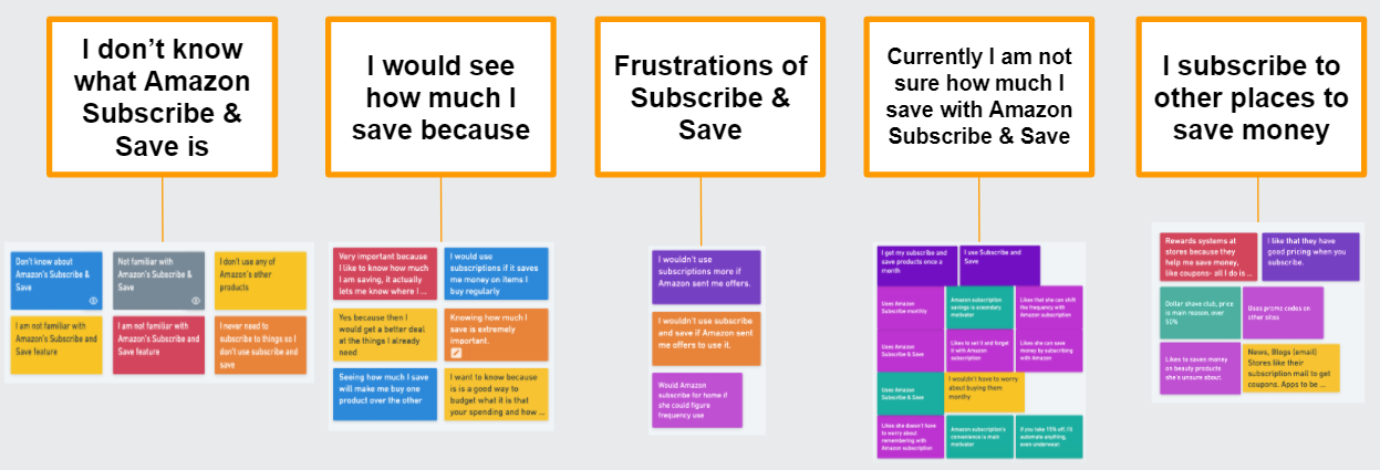
A snapshot of the affinity map.
Competitive and Comparative Analysis
In addition to user interviews, we also performed research on Amazon's competitors and comparators in both the e-commerce and subscription services markets. We wanted to find features that might help improve the Subscribe & Save service.
We found that there were a handful of features that many other sites were using that we felt could improve the Subscribe & Save experience:
1. Notifications for price increases, shipping, and tracking of subscribed orders
2. Product comparison tools
3. A shipping portal for all orders
4. Price and savings information along with infographics
1. Notifications for price increases, shipping, and tracking of subscribed orders
2. Product comparison tools
3. A shipping portal for all orders
4. Price and savings information along with infographics
Our team felt that these were the most important features to include in our design as they were all things that Amazon's app lacked that made the user experience better for many users.
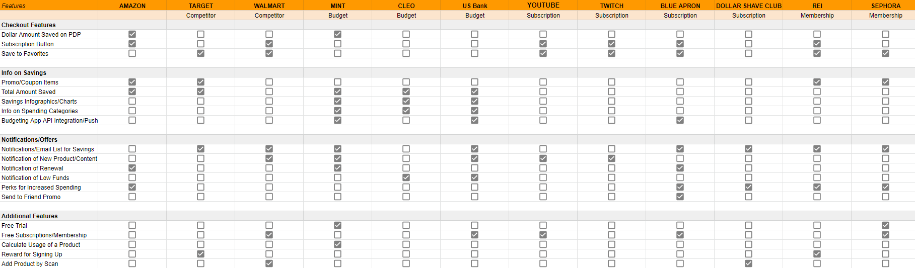
Competitive and Comparative Analysis Chart
Synthesis
Personas
After completing our research, we then moved on to developing personas to better understand our ideal users. We created "On-The-Go Mom" Nicole and "Adulting So Hard" Chris to represent two types of Subscribe & Save users.
Nicole is our power-user who already uses Subscribe & Save but wants to know more about price changes so she isn't surprised when she is charged more on a certain month. She also wants to know how much she is saving on her items in general and manage her deliveries.
Chris on the other hand is the user who needs to have an incentive to sign up for Subscribe & Save. He needs to be able to learn about the service and how much money he can save so he is motivated to sign up for it.
Keeping these two users in mind helped us design the features that we would be including in the new Subscribe & Save.

Our Personas
User and Task Flows
In order to better understand how our users would approach using Subscribe & Save, we created user and task flows for both of them to visualize how they would go about completing tasks on the app.
These user and task flows mapped the decision trees for each user as they went about either signing up for Subscribe & Save or modifying their existing subscriptions.
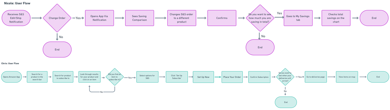
User Flows
Sitemap
We also developed a sitemap of the current app that incorporated the features that we wanted to add for Subscribe & Save users. This sitemap helped us move forward in the design process and keep us on track when prototyping.
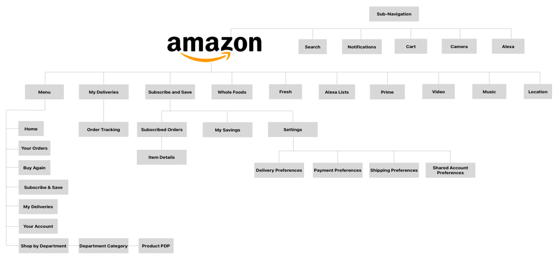
Sitemap
Ideation
Low-Fidelity Sketches
We created sketches of screens that we wanted to create for our final design. These sketches helped us ideate quickly and map out our ideas for our prototype. With so many ideas on the table, we were able to each share our best ones and make a plan for what we wanted our design to look like.
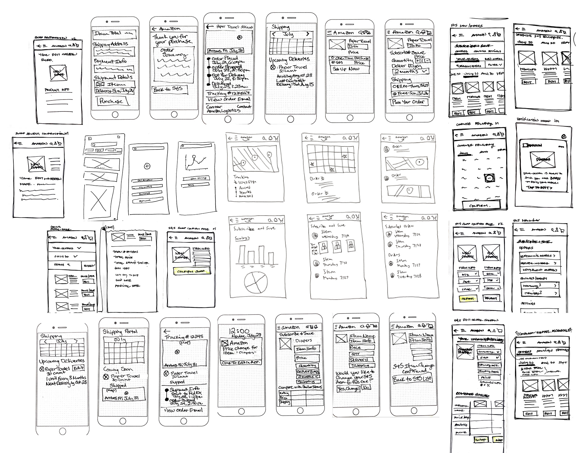
Sketches
Mid-Fidelity Wireframes
After create our sketches of screens and features, we used Figma to develop wireframes of our design. We wanted to make sure that we were staying within Amazon's current app design system so that our features would be seamless with their current app. We designed screens for our new Subscribe & Save pages and redesigned the purchase flow for Subscribe & Save products. Since these were the areas that would benefit our users the most, we felt that they were the most important ones to design.
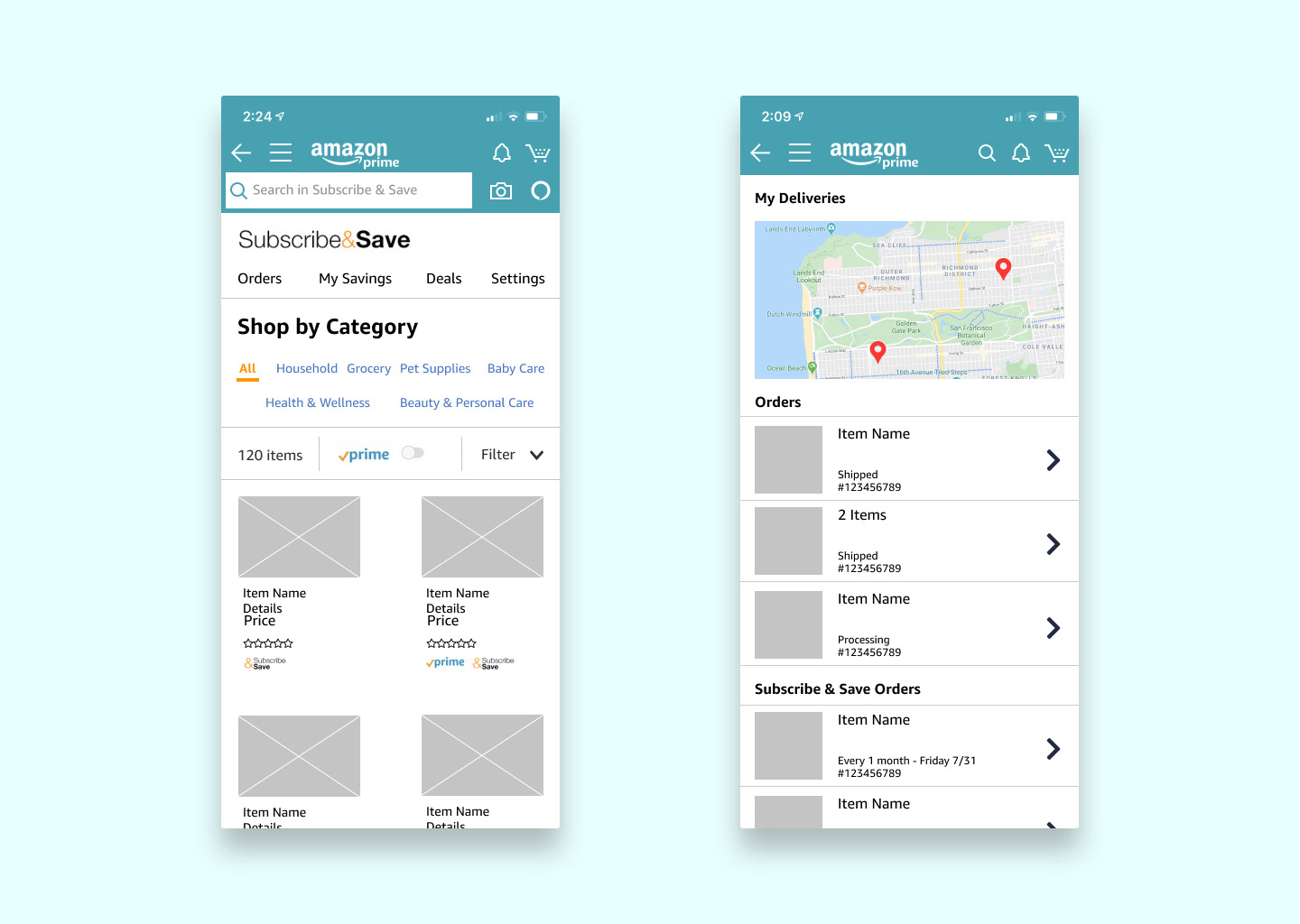
"Subscribe & Save Home" and "My Deliveries" Wireframes (Mid-Fidelity)
Usability Testing
We then turned these screens into a fully interactive prototype and tested it on users. We had users go through two specific tasks that our personas would complete: subscribing to an item and changing one of their active Subscribe & Save subscriptions.
Our findings from these tests indicated that users were looking for more information about the specific dollar amount that they were saving and that users were unclear about where their items were on the "My Deliveries" page.
Final Design
High-Fidelity Prototype
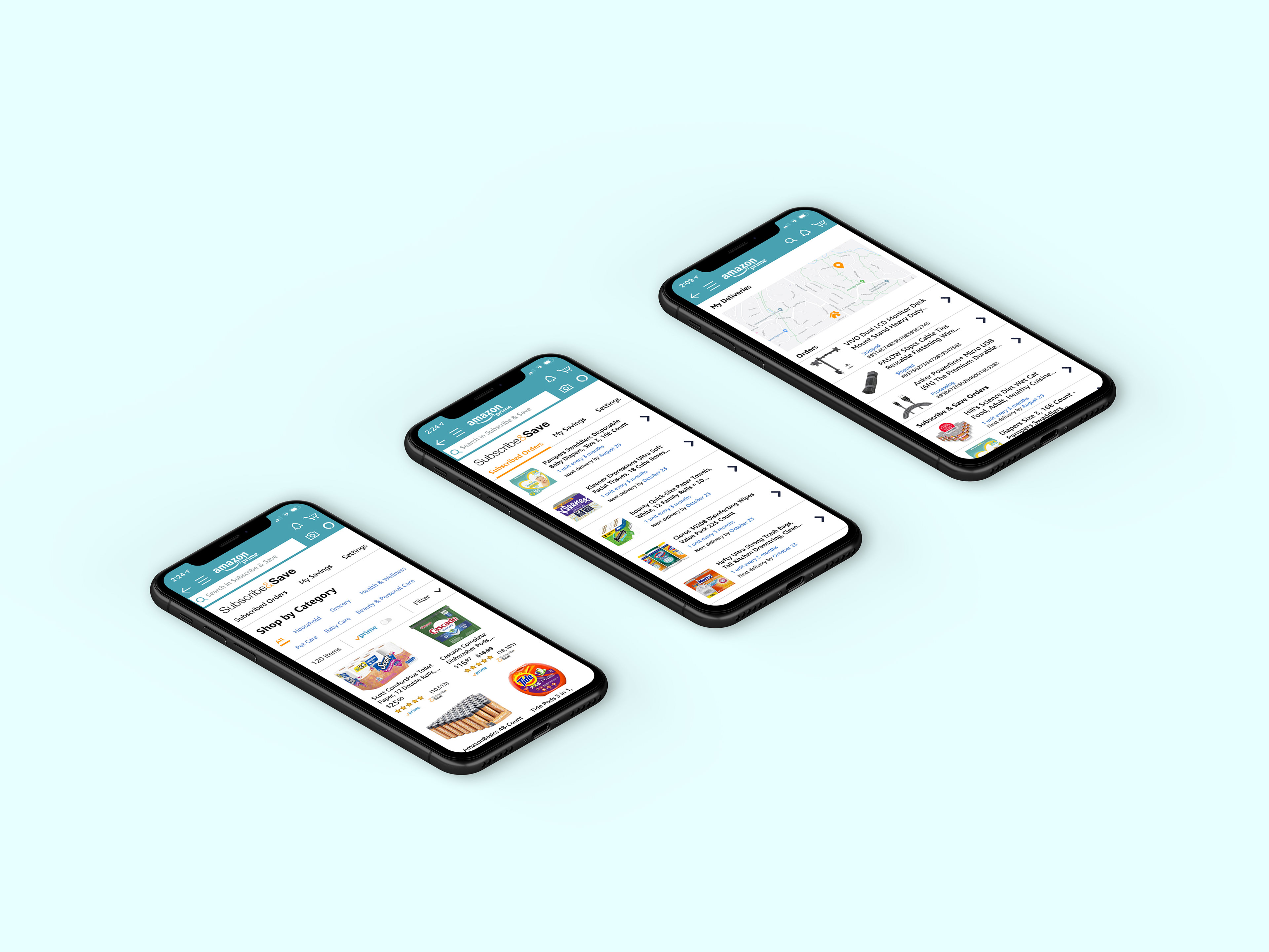
We took the feedback that we received from usability testing and made our prototype high-fidelity so it resembled Amazon's current app. We redesigned the navigation to make it more clear for users what kinds of information would be on each page. We also worked on visual clarity and added specific information about savings to help users see the benefits of the Subscribe & Save service.
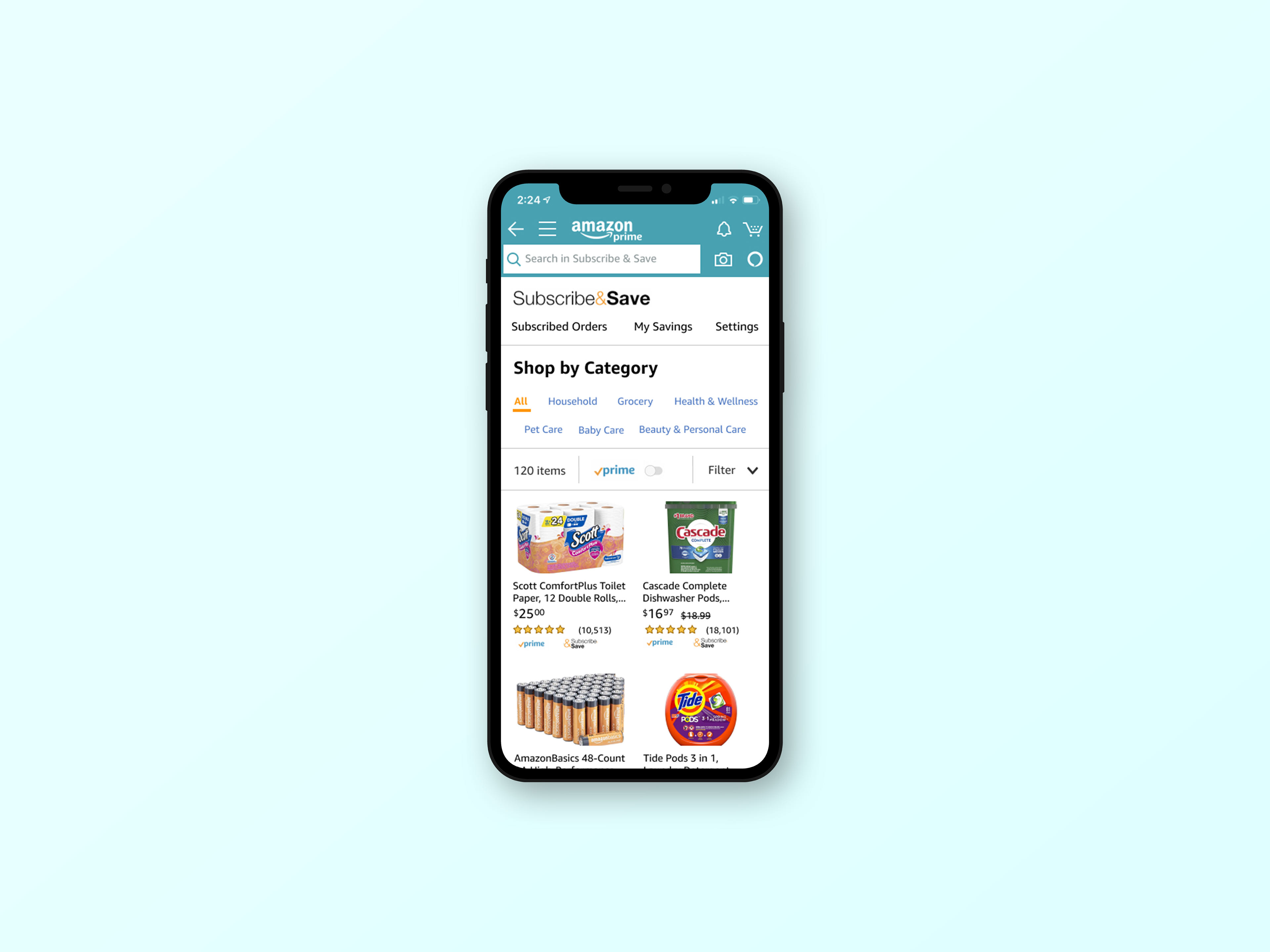
Final Mockup (High-Fidelity)
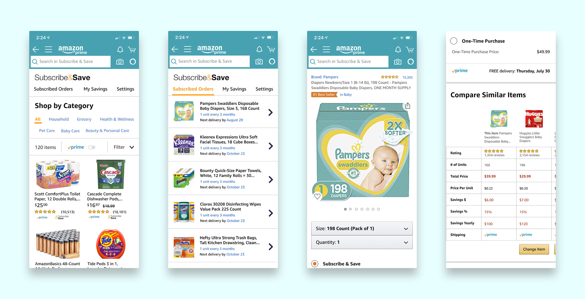
1. Subscribe & Save Modification Flow
We redesigned the pages and process for changing your subscriptions. This was a common pain point for our users before so we wanted to make it easy for them to see how much they were paying for their items and how much they could save with different brands.
The homepage for the Subscribe & Save page was also redesigned to better highlight items the user could subscribe to and to encourage them to sign up.
Subscribe & Save Modification Flow (High-Fidelity)
2. My Deliveries Portal
Currently on the Amazon app, users had to view their normal Amazon orders and their Subscribe & Save orders separately. We found that users wanted a better way to keep track of all their packages that were being delivered so we designed this page to have everything in one place.

"My Deliveries" Page (High-Fidelity)
3. My Savings Page
Users that consistently utilized Subscribe & Save for many purchases wanted to see how much they were saving. We designed this page to give users easy to read data on how much they were saving by purchasing products through subscriptions on Amazon.
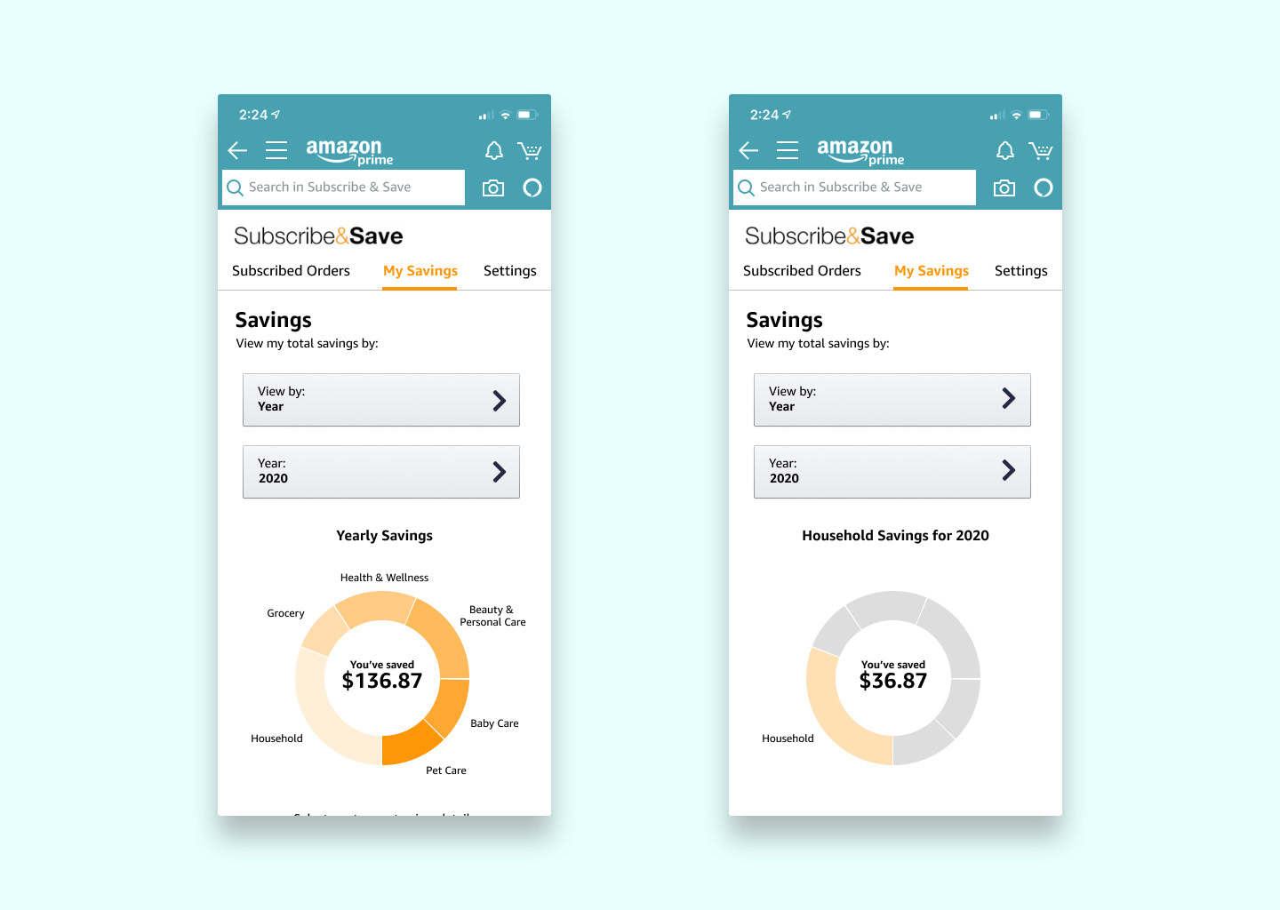
"My Savings" Page (High-Fidelity)
Next steps
The next steps for this project would be to go through another round of usability testing and continue to iterate on our high-fidelity prototype. After this, we could add additional features or flows and then pass it onto developers so it could be potentially added to the app.